


The Real Reason Your Website Isn't Converting (Hint: It's Not What You Think)
Terance pulled up his website during our Strategy Cafe session, and I could immediately see he'd been working with AI to improve his copy. The site looked clean. Professional. The messaging was getting there.
But there were problems. Problems that are so common I see them on almost every website that comes through our sessions.
Here's what happened next - and why it matters for your business.
The Setup: ADHD Coaching Positioned as Parts Work
First, let me give you context. Terance works with people who have ADHD, but he's not positioning himself as just another ADHD coach.
He explained his approach: "I see ADHD as a parts conflict. If you understand the part and what it wants, there are no bad parts. It's about getting them to not be in conflict."
This is smart positioning. He's not selling hypnosis. He's not even really selling ADHD coaching. He's selling resolution of internal conflict.
As I always say - and I told him this directly - people aren't looking for hypnosis. They're looking for a solution to their problem. They want the transformation, not the methodology.
Terance gets this. His headline reflected it: "This isn't laziness, it's internal conflict."
Good start. But then we started finding the issues.
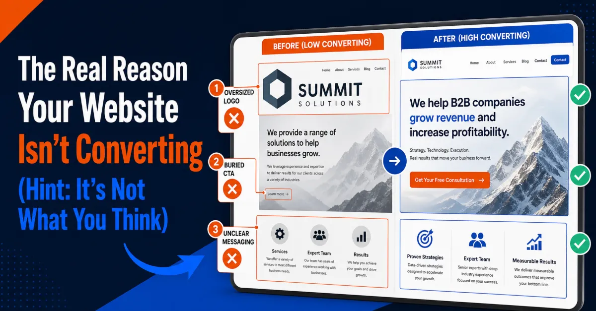
Problem #1: Your Logo Is Eating Your Real Estate
The first thing I noticed when Timothy screen-shared the site: the logo appeared twice, and it was HUGE.
There was a large version at the top of the page, and another version in the navigation. Together, they were consuming almost a quarter of the hero section.
"I'd shrink this down," I told him. "You're killing your real estate. People aren't coming to your website for your logo. They're coming to see if you can help them."
Timothy agreed: "Yeah, if you shrink this, it's gonna pull everything up, so you'll probably end up seeing more of your value proposition above the fold."
This is a mistake I see constantly. People are proud of their branding (and they should be - Terance's logo was actually really nice), but they sacrifice the space that should be communicating value.
Your logo is just a representation of you. It's not the main event.
The main event is answering three questions in the first six seconds someone lands on your page:
1. Who is this for?
2. What does it do?
3. What am I supposed to do next?
If your logo is taking up 25% of the screen, you're not answering those questions fast enough.
Problem #2: The Copy Was Almost There (But Not Quite)
Terance had clearly worked on his messaging. The headline was strong: "This isn't laziness, it's internal conflict."
But then we got to the bullet points describing the problem, and Timothy caught something important.
The bullets read something like:
"You start with a plan, but you wind up paralyzed"
"You can hyper-focus on the wrong thing for hours"
"You procrastinate even when you know what to do"
The structure was good. But the execution was giving people a way out of the emotion.
"I would flip these," Timothy said. "Instead of the good stuff with a 'but' up front, put the pain point up front. Bold it. Don't give them a way out."
He gave an example: "Instead of 'you wind up paralyzed, but you started with a plan,' say 'you wind up paralyzed even WITH a plan.'"
This is subtle but powerful.
Timothy explained it with a Perry Belcher reference: "If you're writing pain points, it needs to be like throwing the baby out with the bathwater. Back the ambulance up, grandma's already dead. You shouldn't add any positives if you're writing negative copy."
When you're hitting pain points, you can't soften the blow. You need them to feel it. Because if they don't feel the problem deeply enough, they won't value the solution.
Then, when you present yourself as the resolution, the contrast is powerful.
Problem #3: The "We" That Came Out of Nowhere
As we scrolled through the copy, Timothy noticed something else.
"You're using 'you, you, you' throughout the page," he said. "Then suddenly you switch to 'we' without ever introducing who 'we' is. Then later you have this line that says 'ask me how I know what that's like' - but you haven't said anything about yourself yet."
This is a common mistake. You're so close to your own copy that you don't notice the logical gaps.
Terance had buried his personal connection to the problem. The line "ask me how I know" appeared way down the page, after he'd already been describing the problem.
"I would move this up," Timothy suggested. "Right under your headline. 'This isn't laziness, it's internal conflict. (Ask me how I know.)'"
I agreed immediately. "Yeah, I was actually thinking the exact same thing. Put it right there in parentheses under the headline."
Why does this matter?
Because people want to know you've been where they are. They don't just want an expert. They want someone who gets it.
By establishing early that you have personal experience with this problem, you're building credibility and empathy simultaneously.
Problem #4: Only One Call to Action on the Entire Page
As Timothy scrolled through the site, he noticed something critical.
"You only have one call-to-action button on the whole page," he said. "I would add them in several other spots."
The rule is simple: anywhere you create emotion, you should have a button.
If you just described their pain points and they're nodding along thinking "yes, that's exactly me," they should be able to take action right there.
If you just shared a case study showing the transformation is possible, they should be able to book a call right there.
Don't make them scroll back up or hunt for the booking link. Put it where the emotion is.
Problem #5: The Headline Didn't Tell Me What It Actually Is
This was my main feedback. The headline was good - "This isn't laziness, it's internal conflict" - but I still didn't know what Terance was offering.
Is this a course? Is it coaching? Is it a live workshop? Is it a book?
The sub-headline said "hands-on learning from plant to practice" - wait, that's not Terance, that's Sherilyn's herb stuff. Let me check the transcript again.
Actually, looking back at the transcript, Terance's site didn't have a clear sub-headline that explained the format. The copy jumped straight into describing the problem.
This is crucial. People need to know:
What format is this? (One-on-one coaching? Group program? Course?)
How long does it take?
What's the commitment?
You can have the best positioning in the world, but if people don't understand what they're actually signing up for, they won't convert.
The Bigger Lesson: AI Can't Replace Strategic Thinking
Terance mentioned he'd used Cassian (Timothy's custom GPT) to analyze his site, then had ChatGPT summarize the ideas, then threw it into Claude for "pretty words."
This is actually a smart workflow. He was using AI as a tool, not as a replacement for thinking.
But here's what AI can't do: it can't tell you that your logo is too big. It can't tell you that your personal story needs to come earlier. It can't tell you that you're giving people an emotional out in your pain points.
AI can help you write better. But it can't think strategically about conversion optimization.
That requires human eyes - preferably eyes that have seen hundreds of websites and know what actually works.
What Terance Did Right
Before I pile on too much criticism, let me point out what Terance absolutely nailed:
1. He positioned himself uniquely. He's not "ADHD hypnosis guy." He's "internal conflict resolution for ADHD."
2. He spoke to the real problem. Not "do you want to be hypnotized?" but "are you struggling with these specific issues?"
3. He tested his work. He didn't just launch and hope. He brought it to us for feedback.
4. He used AI as a tool, not a crutch. He was iterating, not just accepting the first output.
5. He had a clear call to action. Even if he needed more of them, at least he had one.
These are the fundamentals that most people miss entirely.
The Action Items We Gave Terance
By the end of the review, we'd given him a clear list:
1. Shrink the logo and reclaim that real estate
2. Move "ask me how I know" up to the headline area
3. Flip the pain points to lead with the negative, no softening
4. Add more call-to-action buttons throughout the page
5. Clarify the format in the sub-headline (what exactly are they signing up for?)
6. Bold key phrases in the bullet points to draw the eye
7. Fix the "we" language to be consistent
None of these are complicated. But together, they'll probably double his conversion rate.
And that's the thing about conversion optimization - it's not usually one big thing. It's a dozen small things that add up.
What You Should Check on Your Own Website
If you have a website (and you should), go look at it right now with fresh eyes:
The Six-Second Test: Can someone land on your page and within six seconds know who it's for, what it does, and what to do next?
The Logo Test: Is your logo taking up more than 10% of your hero section? If so, shrink it.
The Pain Point Test: Are you softening your pain points with positives? Stop it. Let them feel the problem.
The Personal Connection Test: Do you establish early that you understand their problem from personal experience?
The CTA Test: Do you have calls to action wherever you create emotion? Or just one buried at the bottom?
The Clarity Test: Is it 100% clear what format your offer is? (Course, coaching, workshop, etc.)
Most websites fail at least three of these tests.
Fix them, and you'll see more discovery calls booked. Guaranteed.
The Follow-Up
At the end of the session, Timothy told Terance: "Let's see what this looks like by next Wednesday. If you have time, we'd love to see it and do a much deeper dive."
This is how you actually improve. You don't just collect feedback and file it away. You implement, test, and come back with results.
I don't know yet what Terance's updated site looks like. But I know he's going to implement these changes, because he's the kind of person who takes action.
And that's the real difference between people who succeed and people who stay stuck.
It's not about having the perfect website on day one. It's about being willing to get feedback, make changes, and keep improving.
Want us to review your website live? Join our free Strategy Cafe sessions every other Friday at pykthos.com/cafe. We'll give you the same honest feedback we gave Terance - no pitch, just real help.
